Below is an analysis that I have been working on completing during the Spring semester of 2011 for my Geography 341 course, Weather and Society. I blogged the current conditions daily, along with my prediction for what I expected to happen in the next 24 hours. The analysis below is an overview of some of the things I have learned in this course, along with multiple graphs that pertain to the blogs I have recorded. As you will see from below, this information applies directly to what we have been learning all semester long so we can apply our knowledge on a broader spectrum of day to day thoughts and ideas.
Below, is a graph that characterizes the trends of Average Temperature since the year 1900.
~~~~~~~~~~~~~~~~~~~~~~~~~~~~~~~~~~~~~~~~~~~~~~~~~~~~~~~~~~~~~~~

According to the graph, precipitation is also all over the place and does not follow the trend or average precipitation. There was only a rare few years that came close to following the trend but didn’t stay consistent.
~~~~~~~~~~~~~~~~~~~~~~~~~~~~~~~~~~~~~~~~~~~~~~~~~~~~~~~~~~~~~~
Top ten coldest:
1916
1960
1896
1900
1906
1926
1940
1941
1950
1984
Top ten warmest:
2010
2000
1977
1973
1945
1936
1921
1910
1903
1902
1898
The data shows that there must be a warm up because two of the warmest years occurred within the past ten year whereas the coldest years have not occurred since 1984 which shows me that we can expect possible more warm years to come instead of colder years.
~~~~~~~~~~~~~~~~~~~~~~~~~~~~~~~~~~~~~~~~~~~~~~~~~~~~~~~~~~~~~~~~~~
Below, are some graphs that represent some statistics of Madison and Milwaukee concerning the following topics: Temperature, RH %, Extreme temperatures, rainfall, and cloud coverage.


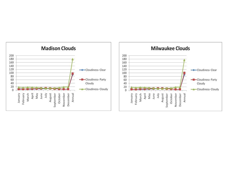
As you can see from the graphs, both Madison and Milwaukee are very similar in all of the above, but for further clarification please see the statistics below.
Milwaukee
Average Temp Min: 18.9 Jan
Average Temp Max: 70.9 July
RH% AM/PM Min: 76 Jan/ 61 May
RH % AM/PM Max: 86 Aug/ 72 Dec
Extreme temp below 32 Min: 0 Jun, July, Aug
Extreme temp below 32 Max: 29 Jan
Extreme temp above 90 Min: 0 Jan, Feb, March, Oct, Nov, Dec
Extreme temp above 90 Max: 4 July
Rain Min: 1.5 Feb. Rain Max: 3.5 July, Aug
Clear Skies Min: 5 Nov
Clear Skies Max: 10 July, Aug
Partly Cloudy Min: 6 Jan, Feb, Nov, Dec
Partly Cloudy Max: 11 July, Aug
Cloudy Min: 10 July Aug
Cloudy Max: 18 Jan
Madison
Average Temp Min: Jan 16
Average Temp Max: July 71
RH% AM/PM Min: Jan 79% /May 56%
RH % AM/PM Max: Sept 91%/ Dec 73%
Extreme temp below 32 Min: July/Aug 0
Extreme temp below 32 Max: Jan 30
Extreme temp above 90 Min: Nov, March 0
Extreme temp above 90 Max: July 5
Rain Min: Jan/Feb 1.1
Rain Max: Aug 4.0
Clear Skies Min: Nov 5 days
Clear Skies Max: July Oct. 9 days
Partly Cloudy Min: Nov Feb 6 days
Partly Cloudy Max: July 11 days
Cloudy Min: July 11 days
Cloudy Max: Dec 19 days
~~~~~~~~~~~~~~~~~~~~~~~~~~~~~~~~~~~~~~~~~~~~~~~~~~~~~~~~~~~~
Below, are a few graphs that represent tempeartures and precipation for Eau Claire, La Crosse, Minneapolis, Madison Superior, Milwaukee and Wausau over the course of the year.


~~~~~~~~~~~~~~~~~~~~~~~~~~~~~~~~~~~~~~~~~~~~~~~~~~~~~~~~~~~~~~~~~


In February, the 8th, 9th, and 10th, correspond with the temperatures I recorded in my blog as low temperature days. The 8th was 0 degrees F, the 9th was recored (-4) degrees F, and the 10th was recored in my blog as 5 degrees F. This trend is also shown in the graph above.
In my March blog a high that correspond to what the graphs shows and what my blog states is on the 31st (46 degrees F). An extreme low that corresponds between the two is on the 2nd it was a cold 13.2 degrees F.
In April, my blog states that the 12th was 68.2 degrees F which mimics the graph above that states an extreme high day was the 12th. Overall, April is consistent with temperatures though so the graph shows that trend also.
Overall, my blog and the graphs did mirror one another very closely. There were a few days that my temperatures were off but that could have been due to the time i recorded them. In conclusion, these graphs are a great representation of the temperatures I recorded in my blog.
~~~~~~~~~~~~~~~~~~~~~~~~~~~~~~~~~~~~~~~~~~~~~~~~~~~~~~~~~~~~~~~

~~~~~~~~~~~~~~~~~~~~~~~~~~~~~~~~~~~~~~~~~~~~~~~~~~~~~~~~~~~~~~~

The above charts show that West is the dominant wind direction and this makes sense because it is normal for weather to move W to E. Wind direction correlates with precipitation in April specifically because there are 13 days where we have E, ESE, and SE winds that characterize precipitation approaching. Also, in March there were 15 days with this same wind pattern characterizing approaching precipitation and this correlates with the findings on the precipitation chart because there are multiply days with precipitation recorded.
Also, April had five days with ESE wind speeds, this tells me that at least 5 days in April should have precipitation and it did (since NE or SE wind direction forecasts precipitation falling in the next 15-20 hours) Also, In April there were only a few days with N winds so this tells me that the overall temperature compared to the other three months should be warmer since N winds normally characterize cold air moving in. To compare and contrast, there is predominantly a West wind which characterizes a normal movement from W to E. One anomaly I found was that January and February had the correct wind direction pattern but there was no precipitation recorded because only rain was recorded in those months, not snow!
As for January, I did not start blogging until the 31st, so I am going to begin talking about my inferences and the charts I made starting in February. The trend that is shown on the temperature graph correlates with the temperatures I recorded throughout the month of February. This graph and my recordings fluctuated tremendously from days like the 9th at 4 degrees F to the 16th where it is 46 degrees F. This sudden increase and decrease in temps I believe stems from the cloud coverage that was present because a majority of my temps were low when there was no insulation, whereas when my temps were higher, I recorded more cloud coverage.
Trends do show on the climographs that temps should increase steadily from Jan.-Jul and that is apparent on our graphs of temperature as an overall. January had the lowest low, February low slightly increased, as did March and April so far. So, as must as I feel it has been a super long winter; temperatures are actually not that far off from where they normally are according to past years.
Currently, after looking at the historical data and graphs done for assignment 5, we can infer that we are in somewhat of a middle ground. This means that that we may expect a record weather conditions in the coming years, but it is not right now. When comparing warmest and coldest Aprils in EC, we are not included on either of those stats. This tells me that we may be due to an extreme high or low in the coming years, because the stats and charts have shown how each high or low is built up over time. Right now I see us on the declining slope of the curve, but do for see our temps warming up in the next few years.
As for March, I do see a correlation between when the big snow storm occurred and where on our precipitation chart there shows a spike in rainfall. This is a direct reflection of what happened the week I was on Spring break. Sadly, I do not have data to correlate with the storm, but I can tell something big happened then and our March temperature on the 22rd correlates with a quick decrease in temps also.
Also, there is only about a 2-3 degree difference between air temperature and soil temperature (that both increase together throughout the day). This tells us that the more solar radiation in the air, the warmer the air and soil. BUT the radiation in the soil does stay warmer than the air starting at about 9 pm. This tells me that the land can hold solar radiation better than the air as an insulator of the heat from the day.
Geographically, temperatures do/can differ from being surrounded by bodies of water, mountainous regions, and wind direction/wind speed. Also, the type of soil may influence the amount of warmth or insulation allowed at a particular geographic location. (Sand holds warmth for example so areas with sand as it soil may experience warmer soil temperatures than a soil that doesn’t insulate as well) This can apply to different seasons because geographically, every city will experience “typical” seasons with characteristics that correspond, but not every city will experience the same conditions so these numbers may differ just due to typical weather conditions in that area on top of the soil conditions.
Agriculture is reliant on soil temperature because for the agriculture business to make it, that means that the soil and the surrounding temperatures and weather have to allow for that land to be plant-able and grow-able. If the soil is too dry, it will not allow plants to grow, if soil is too wet it will drown the crops. Therefore, the soil, which reflects the weather conditions from the past while, then is determined and affected by one another to then in turn allow or not allow us to have a good crop season. Soil must be at a prime level for crops to be planted, grown and sustain, and are directly linked. Too warm of soil will then drink up all the water and not allow enough for plants to live.
~~~~~~~~~~~~~~~~~~~~~~~~~~~~~~~~~~~~~~~~~~~~~~~~~~~~~~~~~~~~
Below, are a few more graphs that I made that apply to the areas including: Hudson, Stevenson, and Hawks. These graphs do no correlate with my blog recordings, but this shows I can broaden my knowledge past the local area and also apply this information to a wide variety of geographical areas.

As you can see in this graph air temperature is fairly consistent with only an increase through the day until 7 pm and then after 7 pm it then begins to decrease back to its original temperature at 1 am. This trend may be due to the fact that the sun is warming the air and therefore the ground consistently throughout the day, hitting its peak around 7 pm. The ground also warms at around the same rate as the temperature increases in the air. Therefore, when the air temperature begins to decrease (around 7 pm) so does the ground temp until it hits the same temperature as it did at 1 am earlier in the day. The other factor is that soil holds warmth better than the air so the soil may take longer to cool down/warm up.
~~~~~~~~~~~~~~~~~~~~~~~~~~~~~~~~~~~~~~~~~~~~~~~~~~~

~~~~~~~~~~~~~~~~~~~~~~~~~~~~~~~~~~~~~~~~~~~~~~~~~~~

As you can see from the graph, Stevenson is located most N and has the lowest starting temperature, but it also rises to be the highest temp. Hawks is in the middle on the temperature graph, but it starts around 33 degrees F and stays consistent until 11 am. At 11 am it finally starts to rise, but it is very slow. I think this could be due to its location of being so close to the large area of water to its North. Hudson starts with the highest temperature in the am and then tapers off to about where the other two are. The total trend is that temperatures are at a low during night hours and then start an increase around 10 am. They then increase until about when the sun goes down and then decrease to where they began.
The temperatures do increase throughout the day and taper off as the sun goes down, but my soil temperatures stay fairly consistent through the day and only start to increase around 1 pm then taper down slowly as the sun goes down. They hold a parallel relationship with each other mainly. I think snow cover would change soil temps less because it is then insulated. I would assume the snow cover is present in Hawks (because the soil temp doesn’t change) but there probably is no snow cover in the other two cities because the soil temp does fluctuate through the day.
Hawks and Hudson both have wind speeds that are all over the place through the day, so this makes me think that there was a storm present or approaching. But Hawks for example has more stable wind speeds so that makes me think there were no storms present/coming. This could have correlated with the big storm we had in December & March, but because we were on break, I did not record that data in my blog.
There is somewhat of a delay between the three cities, and I think it is due to the geographic factor of the storm hitting us the previous day because the storms normally move from W to E. Overall, all three stations are unstable on my graph so I would like to say a low front went through which is characterized by an unstable atmosphere and all over wind speeds